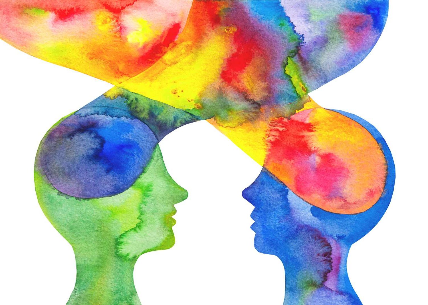
Interior design is more than just aesthetics—it profoundly affects our emotions, productivity, and mental state. One of the most powerful tools in a designer’s arsenal is color. The study of color psychology explores how hues can influence our mood and behavior, shaping the way we experience a space.
What Is Color Psychology?
Color psychology is the scientific study of how colors affect human emotions and behavior. It has been used in marketing, branding, healthcare, and now, increasingly, in interior design. By carefully selecting and applying colors, designers can create environments that calm, energize, or inspire.
The Emotional Impact of Colors
Each color evokes different emotional responses. Below is a breakdown of common interior design colors and their associated psychological effects.
Warm Colors
- Red: Stimulating, passionate, energetic. Great for dining rooms or social spaces.
- Orange: Inviting and lively. Best for playrooms or creative studios.
- Yellow: Optimistic and cheerful. Effective in kitchens or small spaces that need brightness.
Cool Colors
- Blue: Calming and serene. Ideal for bedrooms and bathrooms.
- Green: Balancing and restful. Works well in offices or living rooms.
- Purple: Luxurious and introspective. Suits meditation areas or sophisticated lounge spaces.
Neutral Colors
- White: Clean, open, and minimalist.
- Gray: Modern and balanced.
- Black: Elegant and grounding when used in moderation.
Table: Color Emotions Matrix
| Color | Emotional Impact | Best Use Rooms | Effect on Mood |
|---|---|---|---|
| Red | Stimulating, energetic | Dining room, home gyms | Increases excitement |
| Blue | Calming, serene | Bedrooms, bathrooms | Reduces stress |
| Green | Natural, peaceful | Living room, office | Enhances focus |
| Yellow | Happy, uplifting | Kitchens, hallways | Boosts energy |
| Purple | Creative, luxurious | Meditation spaces, lounges | Inspires creativity |
| Gray | Neutral, balanced | Any room | Creates calm foundation |
| Black | Sophisticated, dramatic | Accents in any room | Adds contrast and depth |
| White | Clean, pure | Bathrooms, minimalist areas | Enhances space perception |
How to Choose the Right Colors for Each Room
Living Room
Opt for inviting and balanced tones. Green, beige, or muted blues create a space for conversation and relaxation.
Kitchen
Bright colors like yellow or white can make kitchens feel more energetic and clean. Avoid overusing red, which may feel intense.
Bedroom
Cool and soft tones like lavender, pale green, or muted gray support rest and tranquility. Avoid harsh or overly vibrant colors.
Home Office
Blues and greens help with focus and concentration. Add yellow accents for mental stimulation.
Bathroom
Whites and aquas create a clean and spa-like atmosphere. Add warm lighting to avoid a sterile feel.
Cultural and Personal Influences on Color Perception
Color psychology can vary based on culture and individual preference. For example:
- In Western cultures, white symbolizes purity; in some Eastern cultures, it signifies mourning.
- Red is often seen as lucky in China but can feel aggressive in other contexts.
Designers should always consider a client’s cultural background and personal associations with certain hues.
The Role of Lighting in Color Perception
Lighting dramatically changes how we perceive color. Natural light brings out the truest shade, while artificial lighting can shift tones dramatically. Designers must test color swatches under different lighting conditions before final decisions.
- Daylight: Best for seeing colors accurately.
- Incandescent light: Warms colors, enhancing reds and oranges.
- Fluorescent light: Can make colors appear cooler and less saturated.
Using Color to Define Space and Function
Colors can delineate different zones in open-concept homes or multi-use rooms. For instance:
- Use blue in a reading nook to suggest calm and focus.
- Use red in a game area to increase energy.
- Soft gray can unify diverse elements across zones.
Trends in Color Psychology and Interior Design
- 2020s Trends: Earth tones, sage green, terracotta, and soft neutrals are increasingly popular for their grounding effects.
- Bold accents: Homeowners are more open to bold accent walls in navy, emerald, or charcoal.
- Wellness colors: Soft pinks, warm whites, and natural greens are associated with wellness-focused spaces.
Color and Material Harmony
Color isn’t applied in isolation. The materials used—wood, stone, textiles—affect how color appears and feels.
- Wood: Enhances warm tones like terracotta, beige, or rust.
- Metal: Pairs well with bold colors like navy or emerald.
- Textiles: Add texture and dimension to color schemes through rugs, curtains, or upholstery.
Mistakes to Avoid
- Overusing bold colors in small spaces.
- Ignoring how color affects lighting.
- Forgetting to balance warm and cool tones.
- Using too many contrasting hues without a unifying element.
Color psychology provides powerful insights into how we experience interior spaces. By using color intentionally, designers can create environments that soothe, inspire, and energize. Whether you’re revamping a home office or planning a full renovation, understanding the emotional language of color is key to creating spaces that truly support well-being and functionality.
In the end, design isn’t just how a room looks—it’s how it makes you feel. Let color be your guide to more conscious, impactful interiors.

Leave a Reply